


The Importance of Responsive Design in Web Development
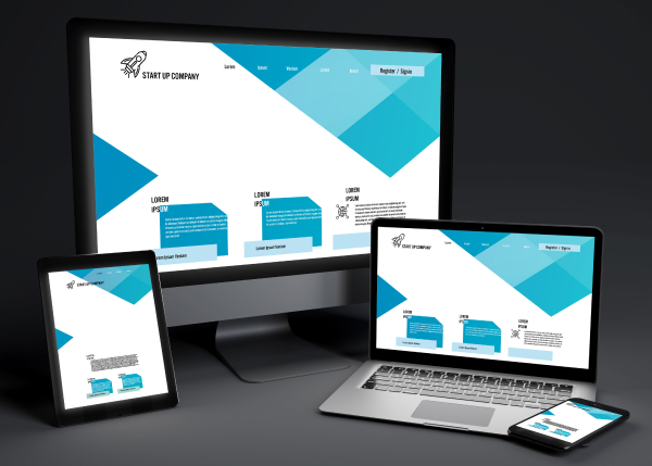
In today’s digital age, users access websites from a wide range of devices—smartphones, tablets, desktops, and even smartwatches. As a result, having a responsive website is no longer an option but a necessity for any business aiming to stay competitive.
Responsive web design ensures that your website adjusts seamlessly to different screen sizes, providing users with an optimal experience regardless of their device.
In this blog, we’ll explore why responsive design is essential in 2024, its impact on SEO, and the tools you can use to implement it.
What is Responsive Design and Why It’s Crucial in 2024?
Responsive design refers to a website’s ability to automatically adjust its layout and content based on the screen size of the device it is being viewed on. This means that whether someone is visiting your site on a smartphone, tablet, or desktop computer, they will have a smooth and consistent experience.
In 2024, responsive design has become critical for several reasons:
- Growing Mobile Usage: Mobile traffic now accounts for more than half of global web traffic, and this trend is only growing. If your website isn’t optimized for mobile users, you risk losing a significant portion of potential customers.
- User Experience (UX): A responsive design ensures that users can easily navigate your site, read content without zooming in, and click on buttons without frustration, which leads to longer site visits and higher engagement.
- SEO Benefits: Search engines, especially Google, prioritize mobile-friendly websites. A responsive website can improve your ranking on search engine result pages (SERPs), making it easier for potential customers to find your business.
Mobile-First Approach: Designing for All Devices
As more users browse the web via mobile devices, developers have adopted a mobile-first approach to web design. This means designing the mobile version of the site first and then scaling up for larger devices. The mobile-first strategy is beneficial because it ensures that the most important and relevant content is easily accessible to users, regardless of the device.
Mobile-first design also encourages:
- Faster Load Times: Mobile users expect fast-loading websites, and by prioritizing mobile design, you can streamline your site to perform better.
- Minimalism and Usability: Designing for smaller screens forces developers to focus on essential features and functions, eliminating clutter and enhancing user experience across all devices.
How Responsive Design Impacts SEO and Search Rankings
Responsive web design has a direct impact on your site’s search engine optimization (SEO) and its visibility in search results. Google has shifted to mobile-first indexing, meaning it primarily uses the mobile version of a site for ranking purposes. If your site is not optimized for mobile devices, you could see a drop in your search rankings.
Here’s how responsive design influences SEO:
- Improved User Experience: A positive user experience leads to longer site visits and lower bounce rates, both of which are ranking factors for search engines.
- Faster Loading Speeds: Mobile users expect quick load times, and slow sites are penalized by search engines. Responsive design often results in faster page speeds, which positively impacts your rankings.
- One URL for All Devices: Instead of maintaining separate URLs for mobile and desktop versions of your site, responsive design allows you to have one URL. This makes it easier for search engines to crawl and index your site, further boosting SEO performance.
Tools and Frameworks for Creating Responsive Websites
To implement responsive design effectively, there are several tools and frameworks that developers use. These frameworks streamline the process of creating adaptable layouts and responsive elements.
Some of the most popular frameworks include:
- Bootstrap: One of the most widely used front-end frameworks, Bootstrap offers a responsive grid system, pre-built components, and powerful JavaScript plugins to help create mobile-first websites.
- CSS Grid: A CSS layout system that provides more flexibility for designing responsive layouts. CSS Grid allows developers to create complex, grid-based layouts without the need for excessive media queries.
- Flexbox: Another CSS layout model that makes it easier to design flexible, responsive layouts. Flexbox is particularly useful for arranging elements in a one-dimensional space (either a row or a column).
These tools allow developers to create responsive designs that ensure consistency and performance across all devices.
Testing Your Website for Responsiveness Across Devices
Once you’ve designed a responsive website, it’s essential to test its functionality across different devices and browsers. There are several testing tools that can help you ensure your site looks and performs well on a wide variety of screen sizes.
Some useful testing tools include:
- Google Mobile-Friendly Test: A free tool that analyzes a URL and reports if the page has a mobile-friendly design.
- BrowserStack: Allows developers to test websites across real devices and browsers to ensure a seamless experience for all users.
- Responsive Design Mode in Chrome DevTools: A built-in tool in Chrome that lets you simulate how your website looks on different screen sizes without needing real devices.
As Per The Research
In 2024, responsive design is no longer just an added feature—it’s a fundamental aspect of modern web development. It ensures that your website is accessible, user-friendly, and optimized for all devices, which in turn improves user experience, boosts SEO rankings, and keeps your business competitive in an increasingly mobile-first world. By using the right frameworks and testing tools, you can create a responsive website that adapts to any screen, providing a seamless experience for your users.
Investing in responsive design not only future-proofs your website but also sets the stage for long-term success in a digital landscape that prioritizes mobile accessibility and user satisfaction.